To design good services, I…
work iteratively
Agile design | user testing | digital forms | plain language
The lesson: You can run user tests on your prototypes (and you should), but nothing is richer than harnessing the feedback you receive once your product is live.
Work products:
These products are deliverables that I played a significant role in producing, but the final product is the result of collaboration with colleagues because service design is a team sport.
The backstory: In Summer 2024, DC along with more than 30 U.S. states launched a new public benefit for students - SUN Bucks (aka Summer EBT). In an effort to bridge the summer hunger gap when students lose access to school meals, the program provided each eligible student with a $120 benefit card to buy groceries.
In the multi-agency effort to launch the program, I took the lead on creating the application form. This product was designed mobile-first (in fact that’s how 90% of users engaged with it), plain language, and easy to complete for an entire household in 15 minutes or less. Given the simple requirements of the form, I used off-the-shelf software to build and host it for less than $2,000 a year (read more about my quest to be resourceful). Users gave us high satisfaction ratings with 88% giving us a happy face.
But what I’m most proud of is how this design used real-time user feedback to get better. We soft launched the SUN Bucks application two days before we publicly announced its opening. In those first days, we closely monitored the data coming in to see how the application was and wasn’t working.
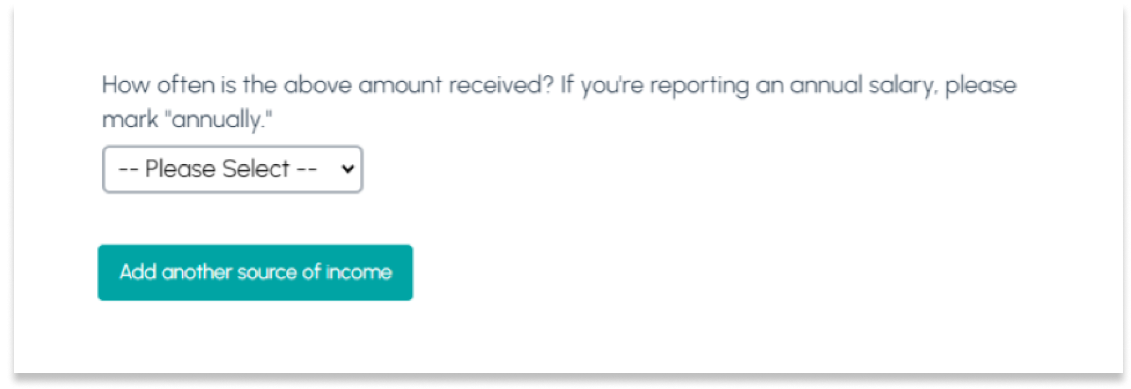
Two issues stood out. First, about 5% of applicants were making an obvious error when they reported their household income–they listed what appeared to be an annual salary—something like $40,000—but then they listed the frequency that they received it as “biweekly.” This is how the question set was phrased:
You can see how the applicant got there. They receive their salary as a biweekly paycheck. But our code to determine income eligibility was reading that entry as $40,000 coming in every two weeks. That meant their household’s annual income was calculated as over $1 million dollars and their benefit request would be denied.
So we tested out a language tweak. We changed the question about frequency and added a note about annual salaries:
Over the next couple of days, we watched new applications come in and the error rate on that question dropped from 5.1% of applications to 3.4% of applications–a 33% decrease.
The second thing we noticed during those first few days–about 5% of applicants were listing their household members and failing to mark anyone as a student. But being a student is what makes you eligible for SUN Bucks. We were confident these applications were the result of a typo, not a misunderstanding of who the program was for. Our application opened with a prominent, “Get help buying food for students during the summer.” So we added a warning message to appear if an applicant didn’t mark any students in their household:
This error rate fell from 5.5% to 1%. Over the course of the three month program, this single warning message saved 630 families from being denied because they missed the place to mark their student(s).
We saw this reflected in our drop-off rates across the application. Among users who started an application, but didn’t submit, over 80% exited at one of our built-in checkpoints–either 1) we think you might be over income; 2) you didn’t list any students in your household; or 3) review what you’ve told us is your household’s income. This plus our completion times–75% of users completed the form in 15 minutes or less–I’m confident that we refined an application that didn’t fatigue or confuse parents.


